
CASE STUDY / 2026.08.12
A sweet shop
founded in 1953,
reframed for the
next visit.
We did not reduce a historic shop to decorative “Japanese style.” Photography, language, space and information were shaped into one experience—from anticipation before a visit to reconnection through LINE.
- CLIENT
- Nagon Shiruko
- PLACE
- Komachi Street, Kamakura
- SCOPE
- Information architecture / Web / LINE / Film
- FOUNDATION
- 1953
NOT A RETRO THEME. A LIVING SHOP.
Turn history into
a reason to visit today.
Nagon Shiruko has been shaped by time since 1953: azuki beans, tableware, a wooden sign and the quiet wait for a bowl of sweets. The value was already inside the shop. The task was to place that reality in an order a first-time visitor could understand.
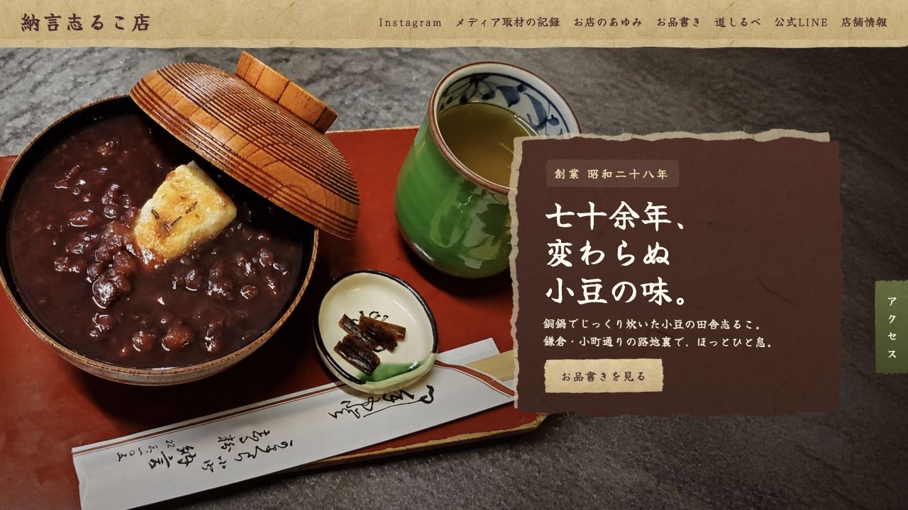
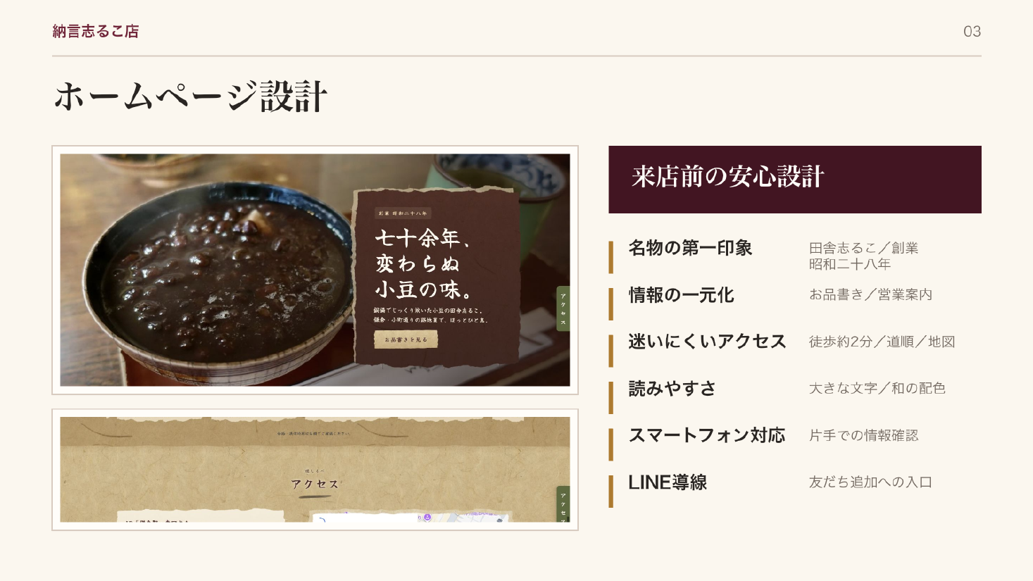
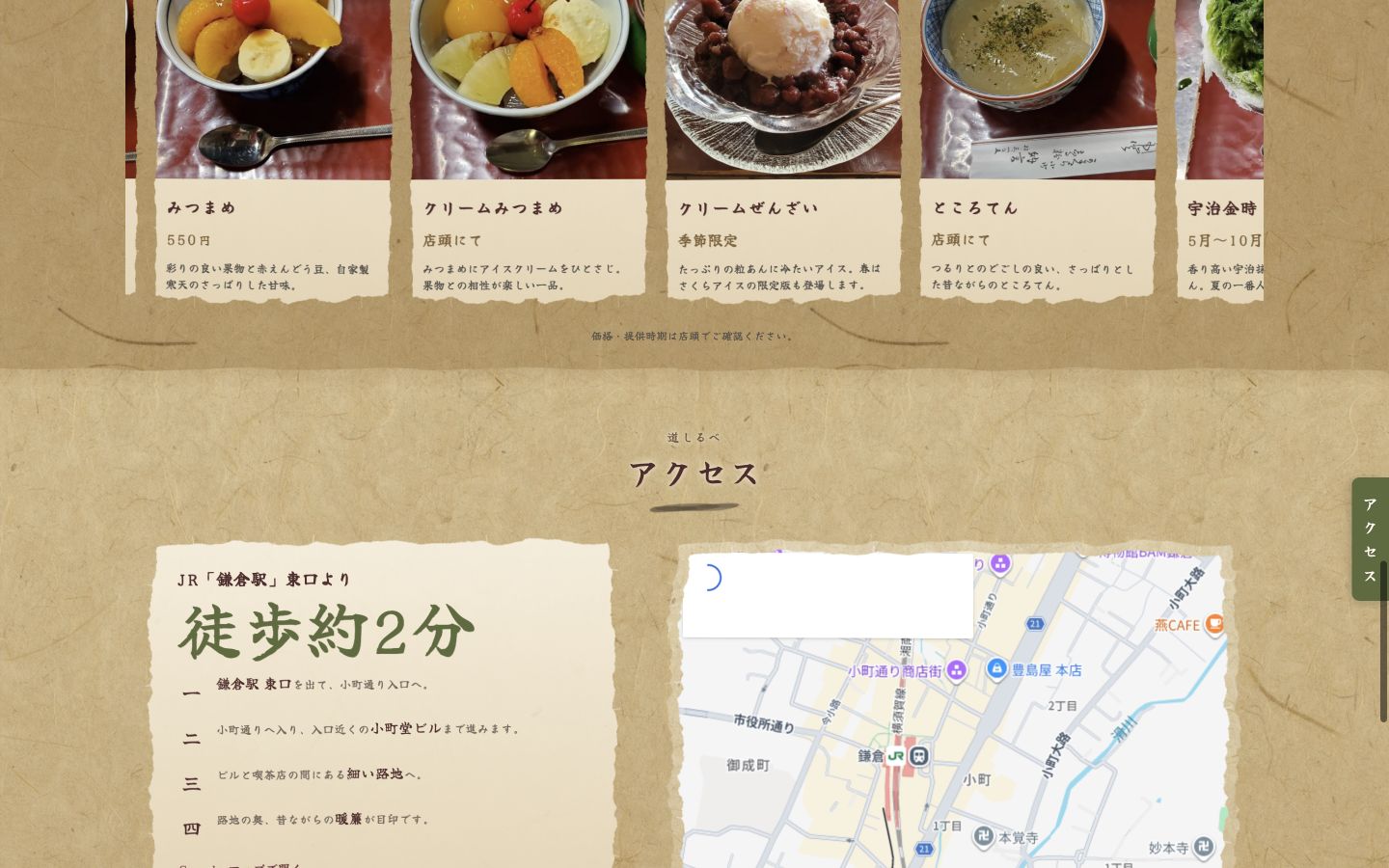
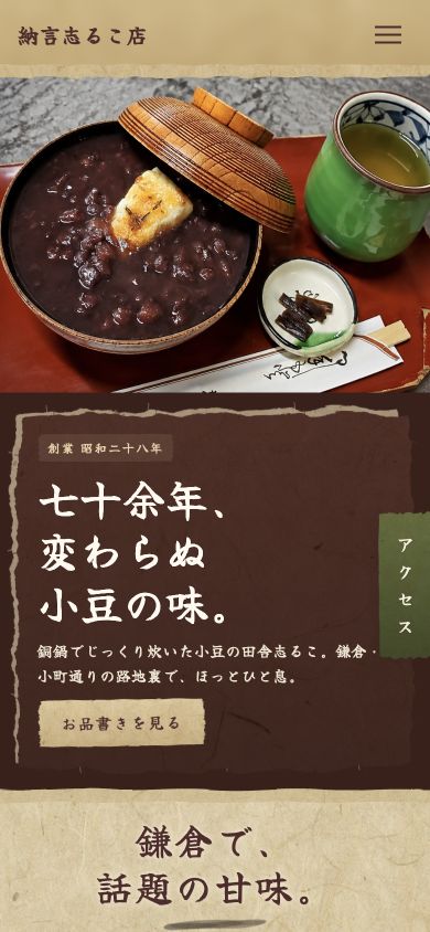
The website therefore became a digital storefront before the visit—a clear path from the shop's story and sweets to the menu, opening hours, location and the physical shop in Kamakura.
WASHI / AZUKI / STEAM / HANDWRITING
Build the screen from
materials already in the shop.
Colors came from azuki beans and tableware; texture from washi paper and wood; spacing from old shop signs and handwritten menus. The sweets and photographs remain the protagonists.
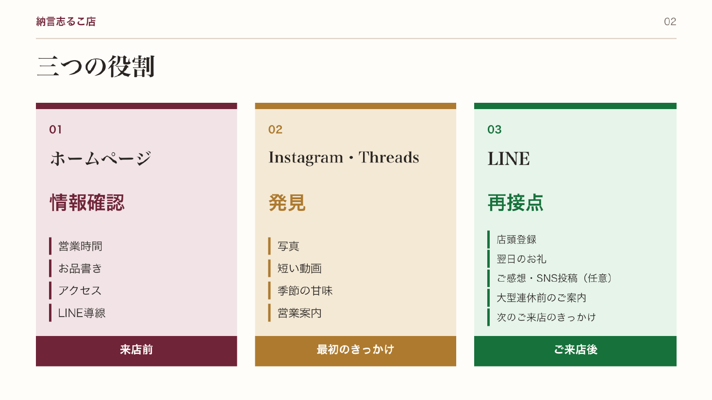
Before visual design began, we mapped the roles of the website, Instagram, Threads and LINE—where people discover, verify and reconnect with the shop.
FROM DISCOVERY TO VISIT
Discover. Desire.
Check. Visit.
Beautiful photography is not enough; accurate shop information alone is not enough. Once interest grows, the menu, hours and access must follow naturally. Mobile density and order were designed separately for people checking information while traveling.
- 01DiscoverSEARCH / SOCIAL / REFERRAL
- 02FeelSWEETS / HISTORY / ATMOSPHERE
- 03CheckMENU / HOURS / LOCATION
- 04VisitKOMACHI STREET / KAMAKURA
A SECOND ENTRANCE
Use LINE as an entrance
to the next visit.
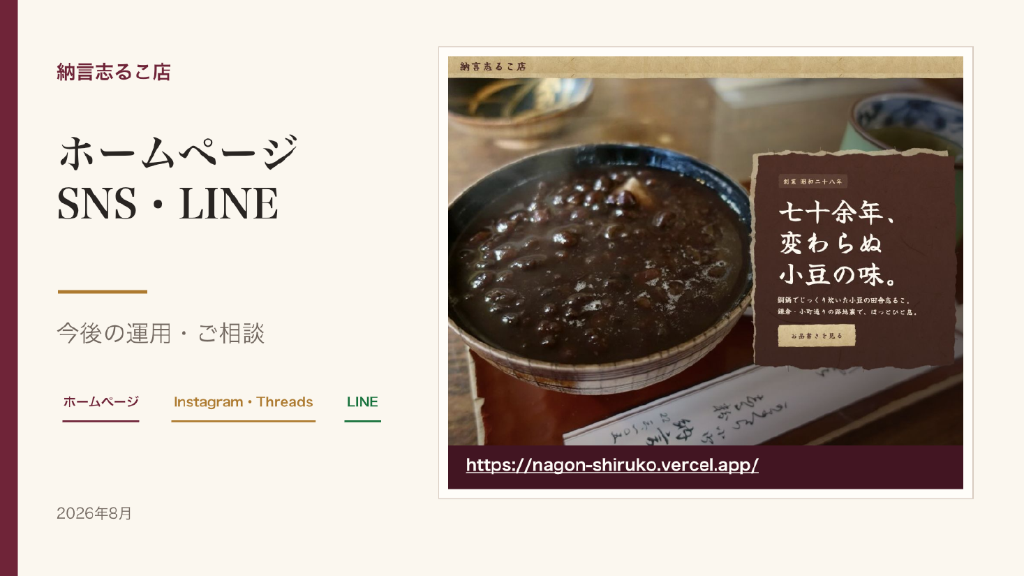
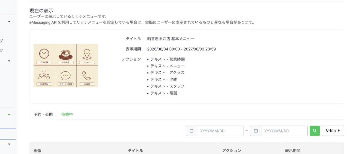
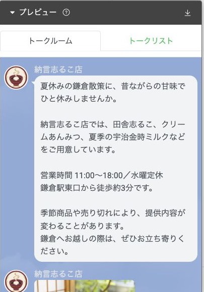
The website supports pre-visit understanding, Instagram and Threads create discovery, and LINE provides a return point after the visit. The official LINE account makes hours, menu and access easy to find again.
The official LINE friend-add journey uses approved LINE brand assets, keeping everyday usability clear while respecting the site's visual world.
- WEB
- Information before a visit
- SOCIAL
- Discovery through image and film
- LINE
- Reconnection after a visit
A WORLD THAT WORKS
Do not separate atmosphere
from usability.
The film presents discovery, visit and reconnection as one continuous experience. The website was tested separately on desktop and mobile, including text overlap, horizontal overflow, external links, LINE and access routes.
THE POINTWe did not imitate the look of a historic shop.
We translated its accumulated time for the next visitor.
LISTEN / DESIGN / BUILD / GROW
Planning and dialogue.
Build and film.
One story.
The process begins by listening to the time the shop has inherited and what its people value—not by making a beautiful website in isolation. The film follows that thinking across language, photography, Web, social and LINE.
From the shop entrance and signature shiruko to the design process and confirmation with the owner, the 68-second film reveals how decisions become a live experience.
LIVE TODAY
Not finished at launch.
Connected to the shop today.
WEBOfficial website liveHours, menu and access available on desktop and mobile.
LINEOfficial LINE connectedFriend-add and rich-menu routes return visitors to essential shop information.
FILMIntroduction and website films producedThe journey from discovering the shop to visiting it is visible in motion.
PROJECT OUTCOME
History, atmosphere, information and action.
One coherent storefront.
Whichever touchpoint people enter through, they feel the same shop, find what they need and visit without confusion. Iconication connects the relationship before and after the visit—not only the final screen.